Challenge
How might we turn a low-value, template-driven app into a cohesive digital experience that reflects Caffenio’s service model and brand voice and build a scalable foundation for their internal development team?
Approach
I conducted a comprehensive diagnosis of the current app, identifying technical and UX inconsistencies that affected registration, navigation, ordering and account access. This included redundant user data, broken login flows, and confusion around key features like loyalty and user settings.
Working alongside internal teams, I led the redesign process from user research to final handoff, aligning every decision to business goals and user needs.
Outcome
Although the full implementation was delayed due to internal team changes, the redesign was met with enthusiasm. The new system clarified user flows, elevated the app’s perceived value, and set a new UX benchmark internally. Even in partial stages, it improved collaboration and product alignment across teams.
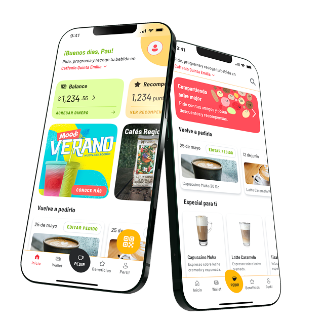
Process Highlights
User research & benchmarking
Conducted interviews with active and potential users across regions, as well as internal teams, to understand business goals and feature expectations.


UX & feature restructuring
Introduced onboarding, user profiling, loyalty point integration, single-screen order summaries and a group ordering flow (ahead of the curve in the local market). Simplified product customization and integrated a wallet system that unified physical gift cards.


UI system & visual redesign
Applied Caffenio’s updated brand palette and illustration style. Used Atomic Design methodology to build scalable components from atoms to full layouts.

Functional prototyping
Simulated complete user flows in Figma including group orders, component states and happy paths for all key scenarios.


Developer enablement
Delivered clear documentation and met weekly with the dev team to ensure proper understanding of design logic, naming conventions, and system behavior.


