Inspiración para Crear
Designing a brand that quotes, references, and inspires
Brand Development
+
Visual Language
+
Internal Architecture
2022
@RedBox
Inspiración Para Crear (IPC) emerged from a set of scattered initiatives inside RedBox, including a weekly newsletter, a blog of innovation cases, and training materials used in consulting projects. As the company’s Partner Director sought to formalize this content under one unified platform, IPC was born to test its potential as a standalone content-driven business unit.
Challenge
How might we create a brand and content platform that feels independent yet connected to RedBox, expresses thought leadership in Spanish, and scales across digital formats while staying accessible to non-designers?
Approach
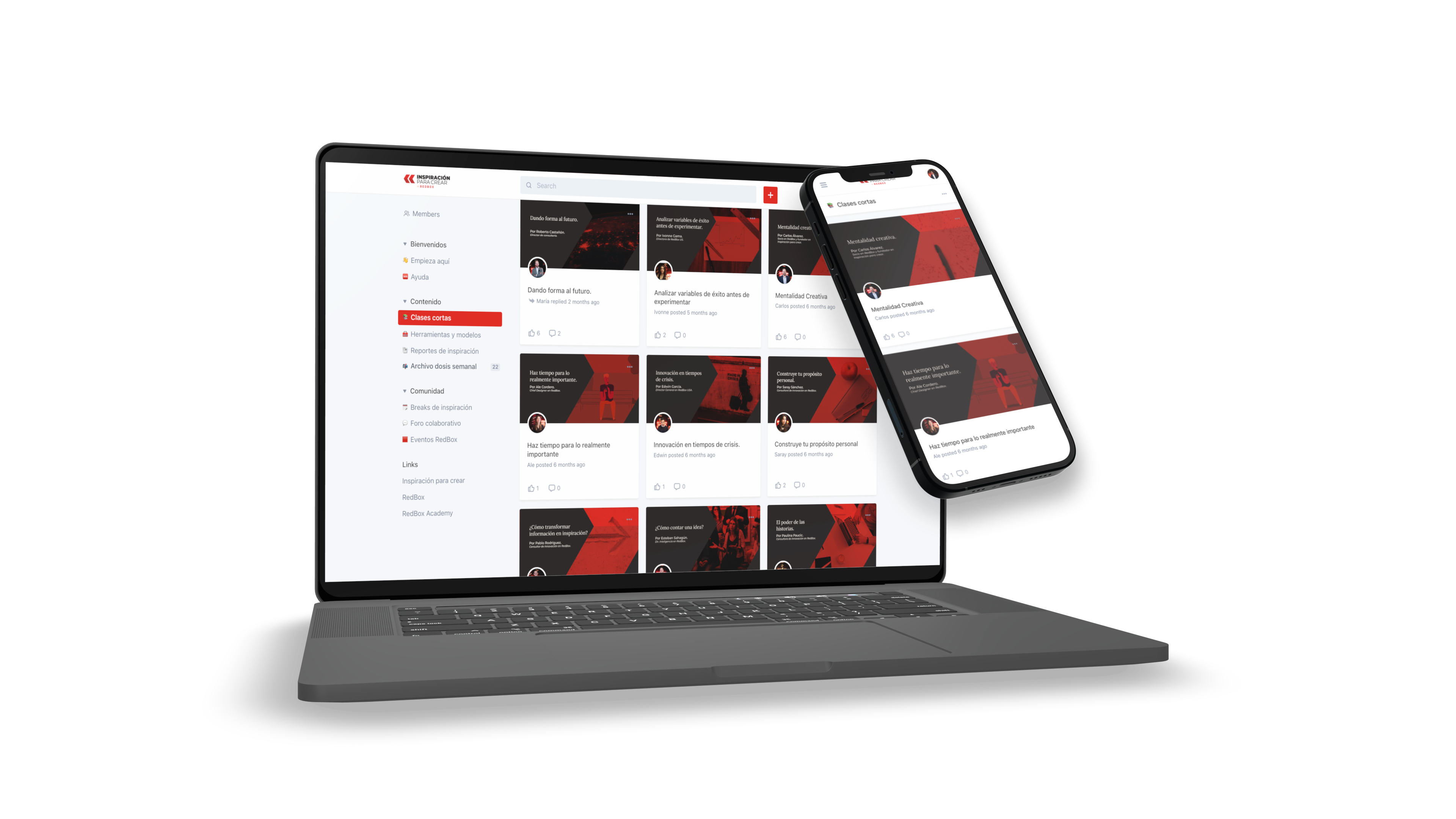
From early conversations, I supported the definition of IPC’s dual identity: a public-facing inspiration feed (articles, newsletters, posts), and a private membership space for premium content, soft-skills classes and community building.
I helped articulate the visual personality by building on RedBox’s brand DNA and giving it a new expressive tone. My design direction was shaped by the idea of referencing and quoting, positioning IPC as a thoughtful, credible but approachable source of inspiration in the Spanish-speaking world.
Outcome
Internally, IPC became a catalyst for publishing, experimentation and knowledge sharing across teams. Its design system demonstrated the potential to extend RedBox’s brand beyond consulting and helped shape the visual evolution of other initiatives like RedBox Academy. It also served as a testing ground for building flexible tools that matched the needs of both designers and non-designers alike.
What I Learned
This project was a rare opportunity to follow a brand system from conception to deployment. I learned how to design for autonomy across internal teams, build with long-term maintainability in mind, and shape a brand that lives between editorial, educational and strategic territories.
Process Highlights
Brand language creation
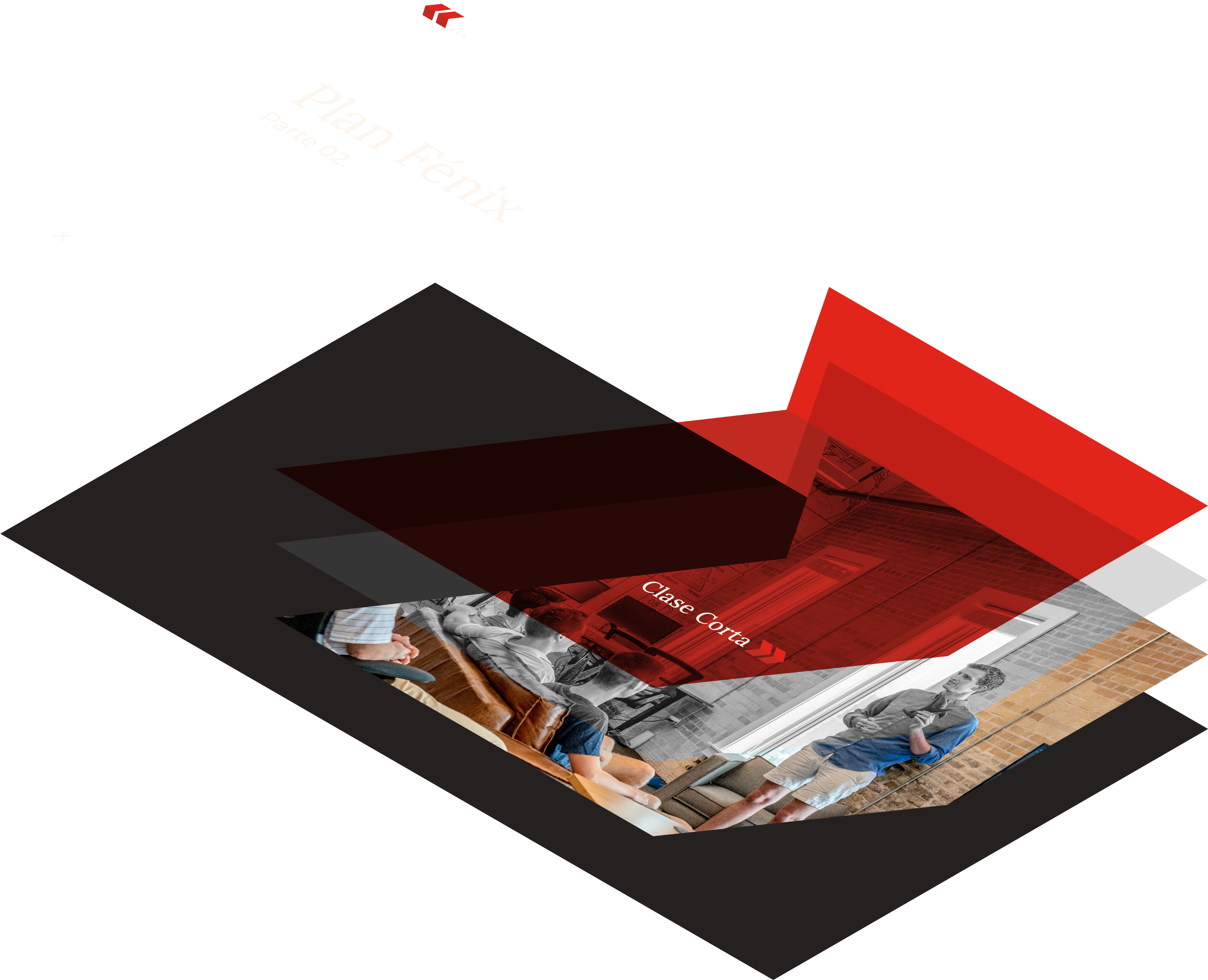
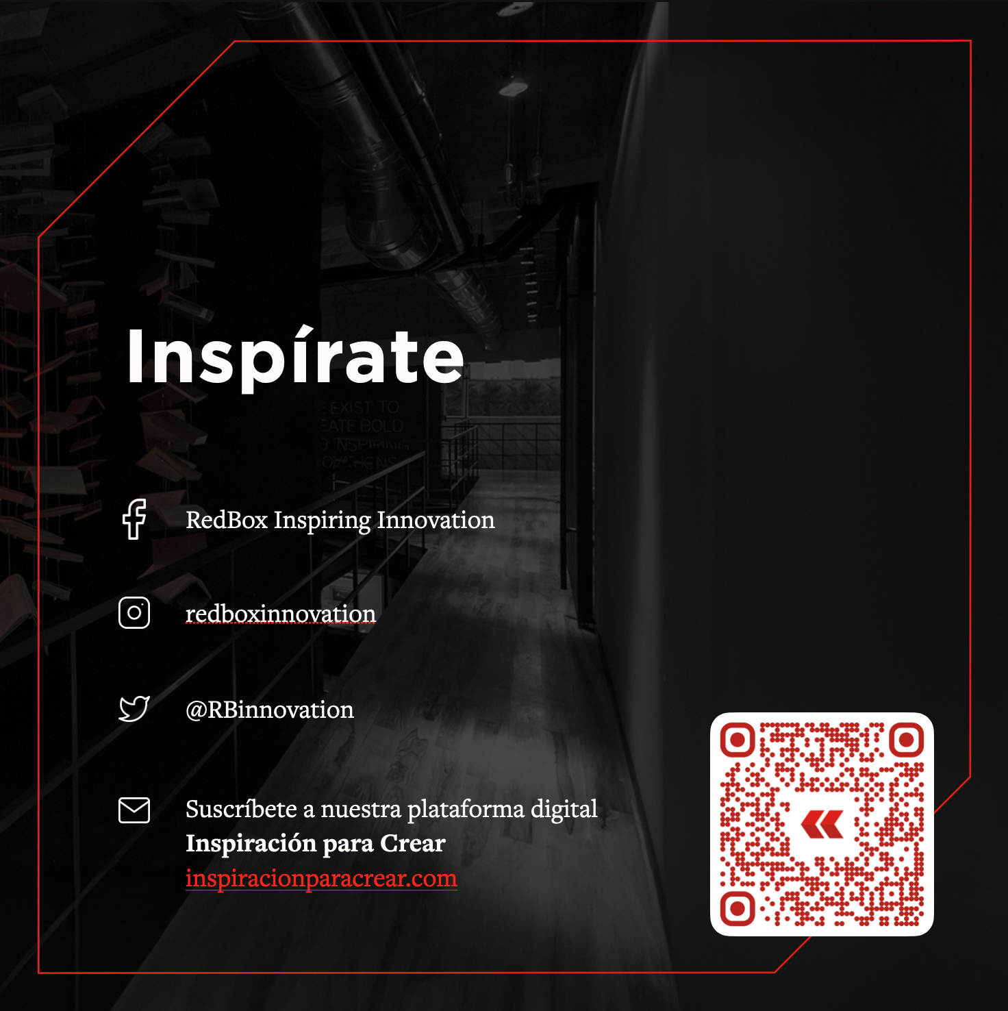
Designed the full visual identity starting from RedBox’s existing box-shaped logo, reimagined as a Spanish opening quotation mark («). This symbol bridged IPC’s essence (quoting, referencing, opening ideas) while nodding to RedBox and its linguistic-cultural context.
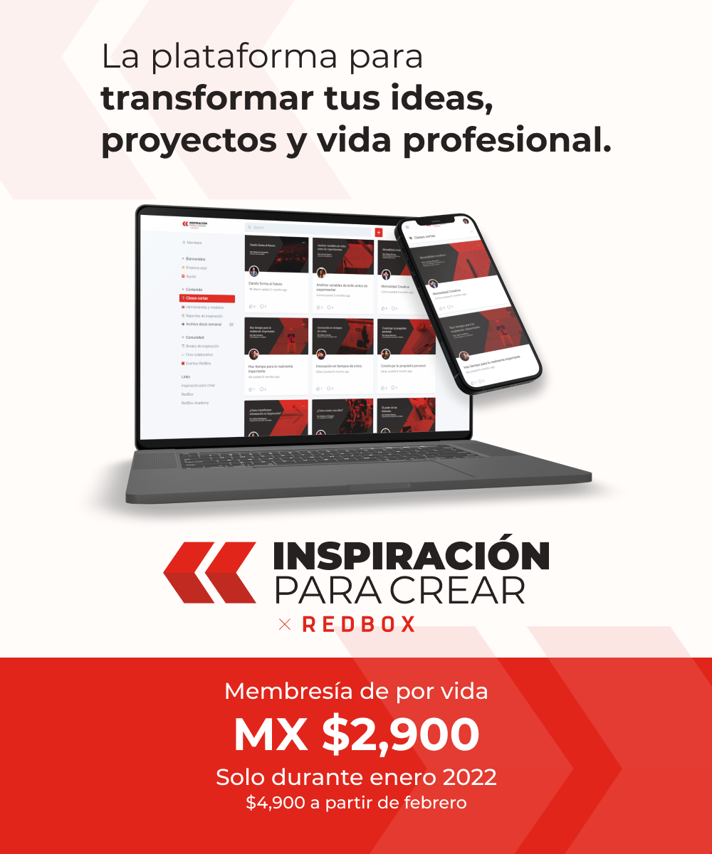
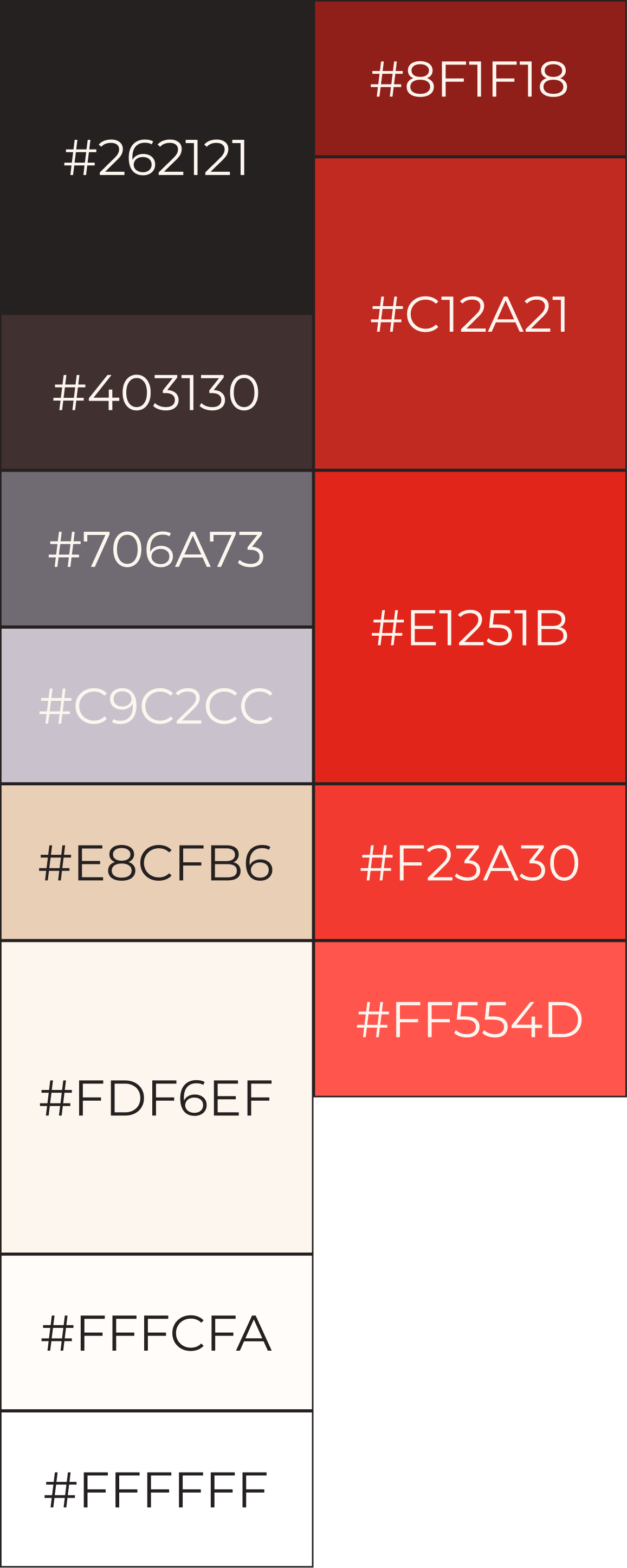
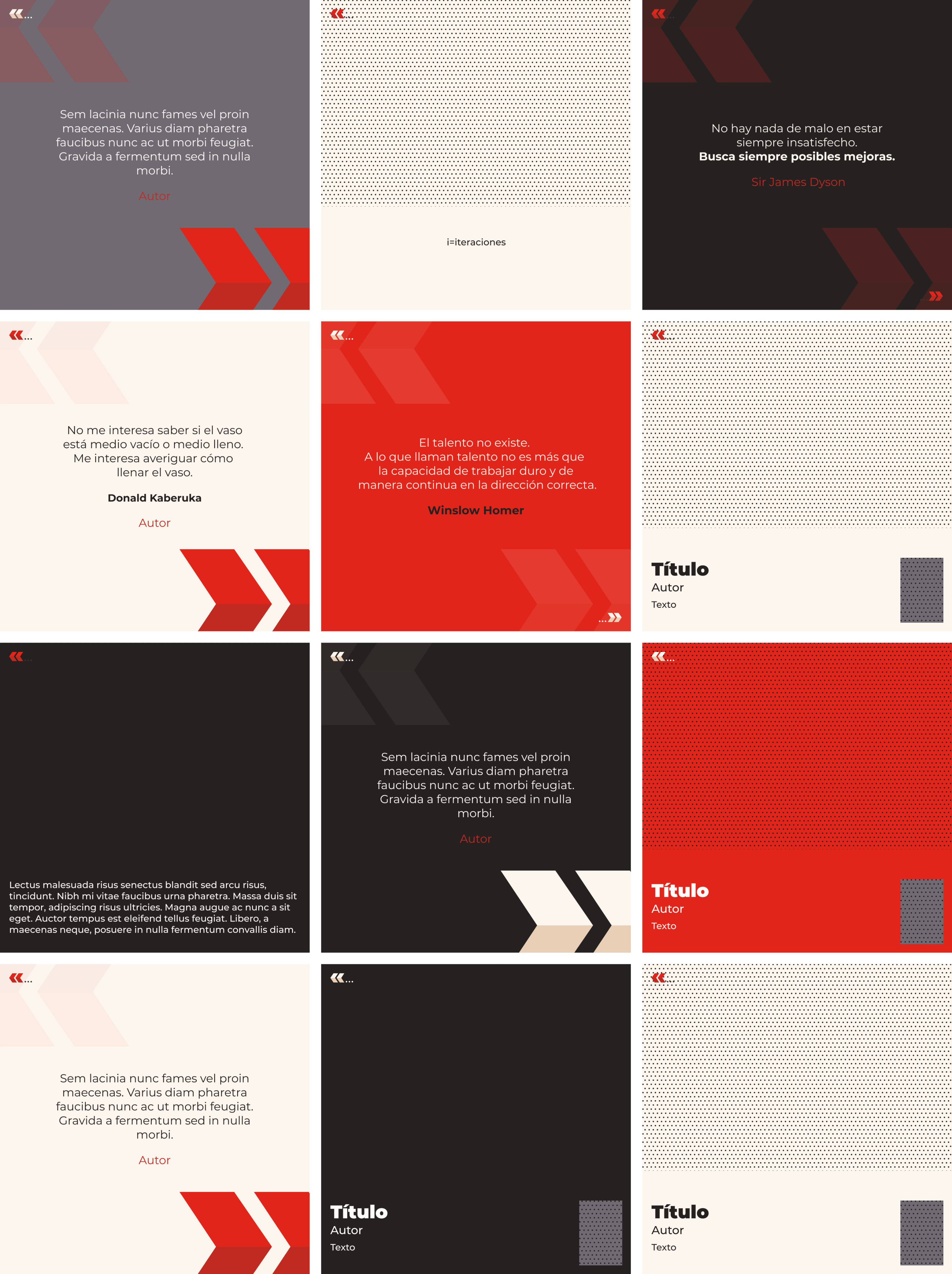
Balanced authority and community through visual choices: warm but structured color palette, clear typographic hierarchy, and content-forward design.
Design system for scale
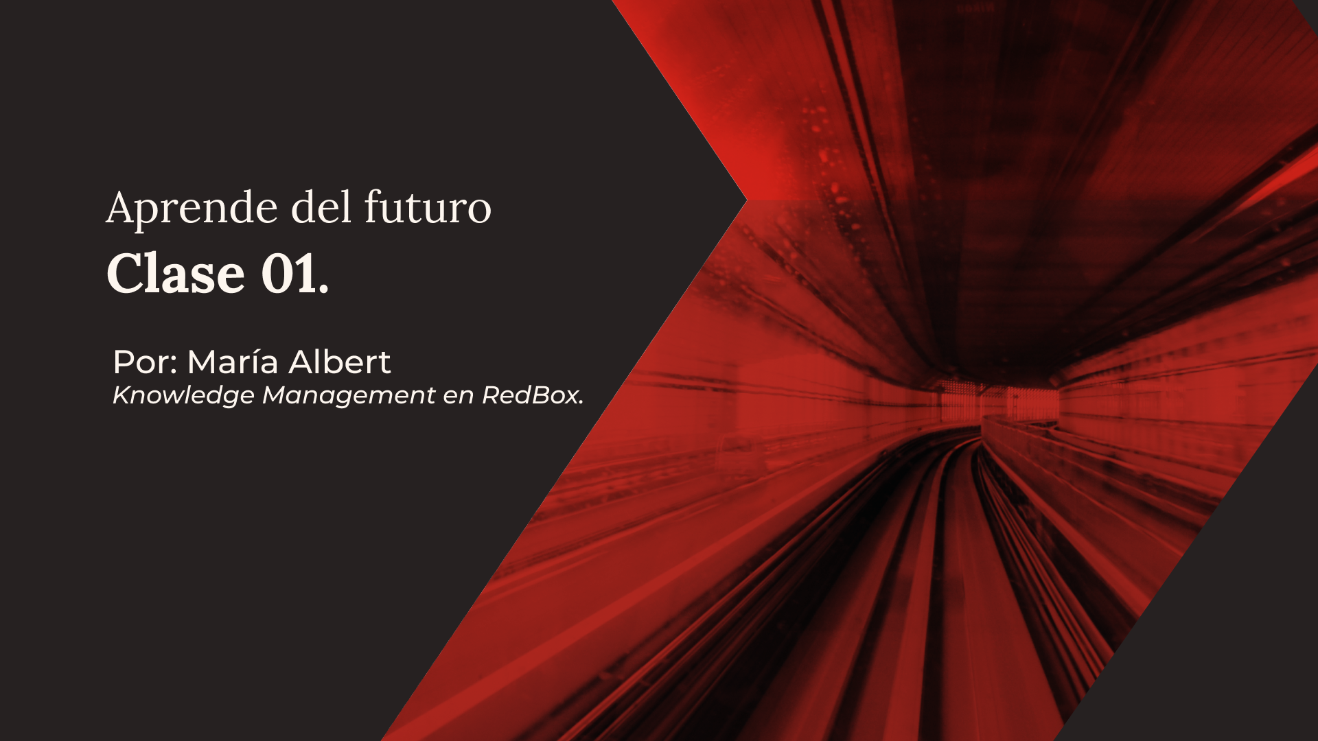
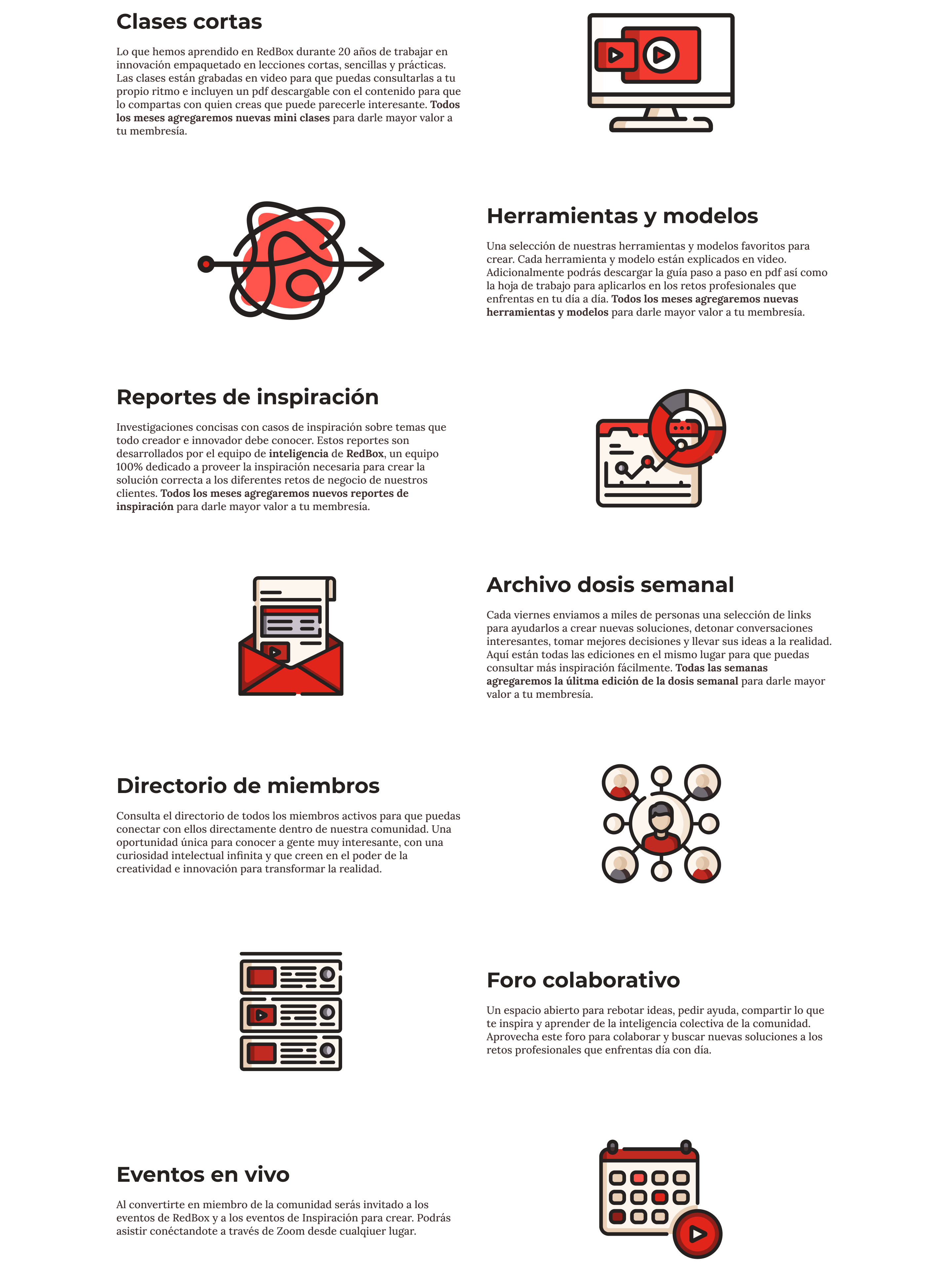
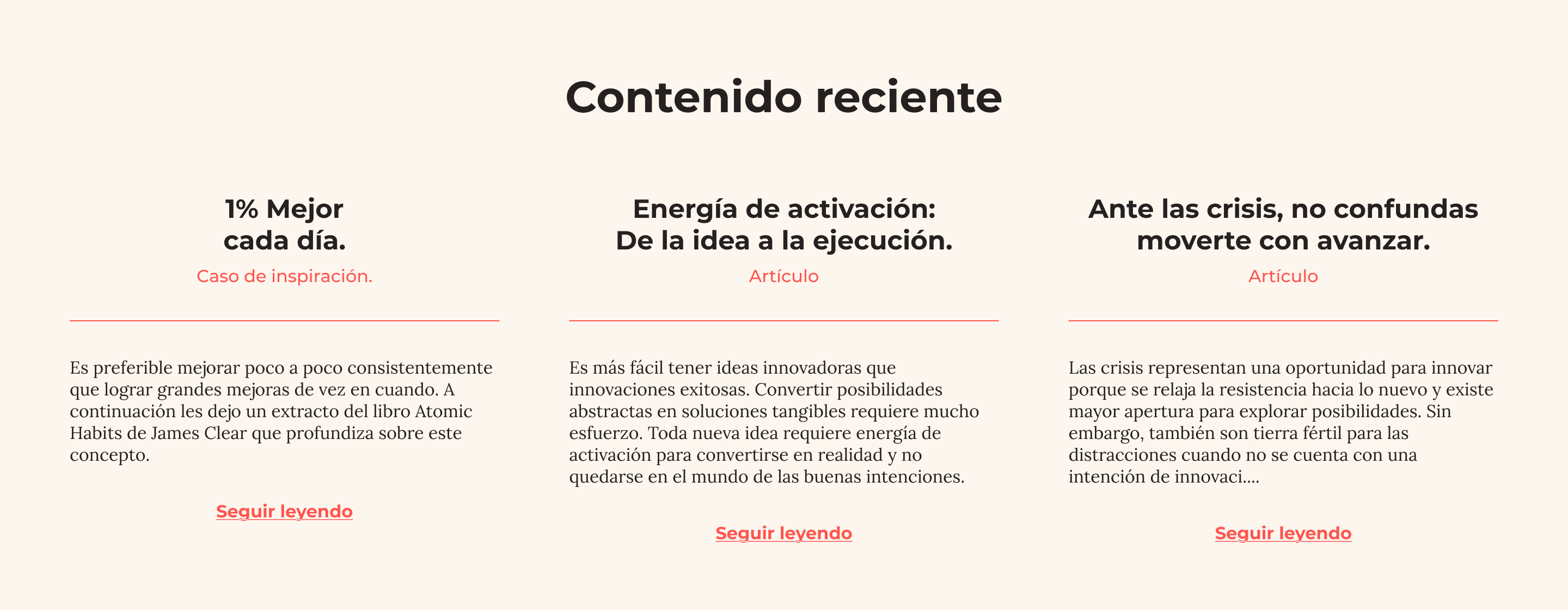
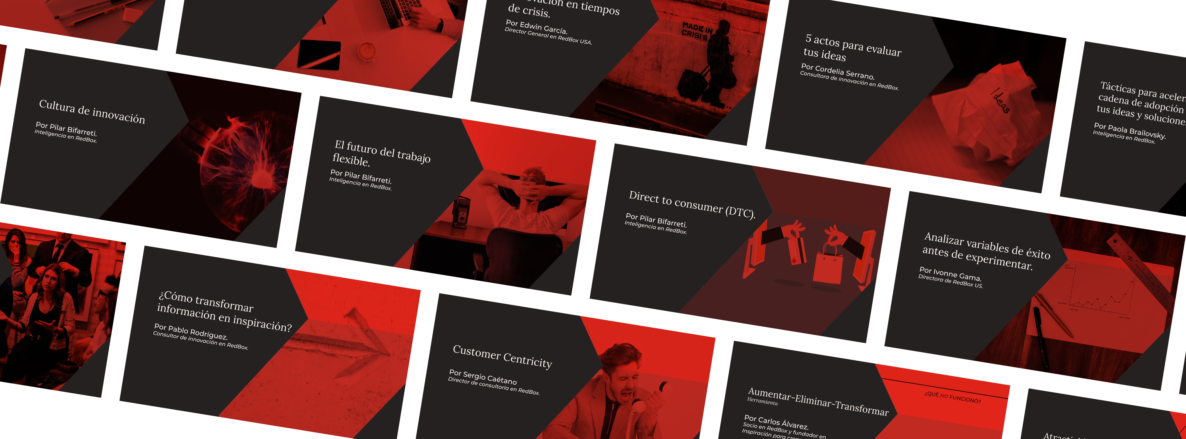
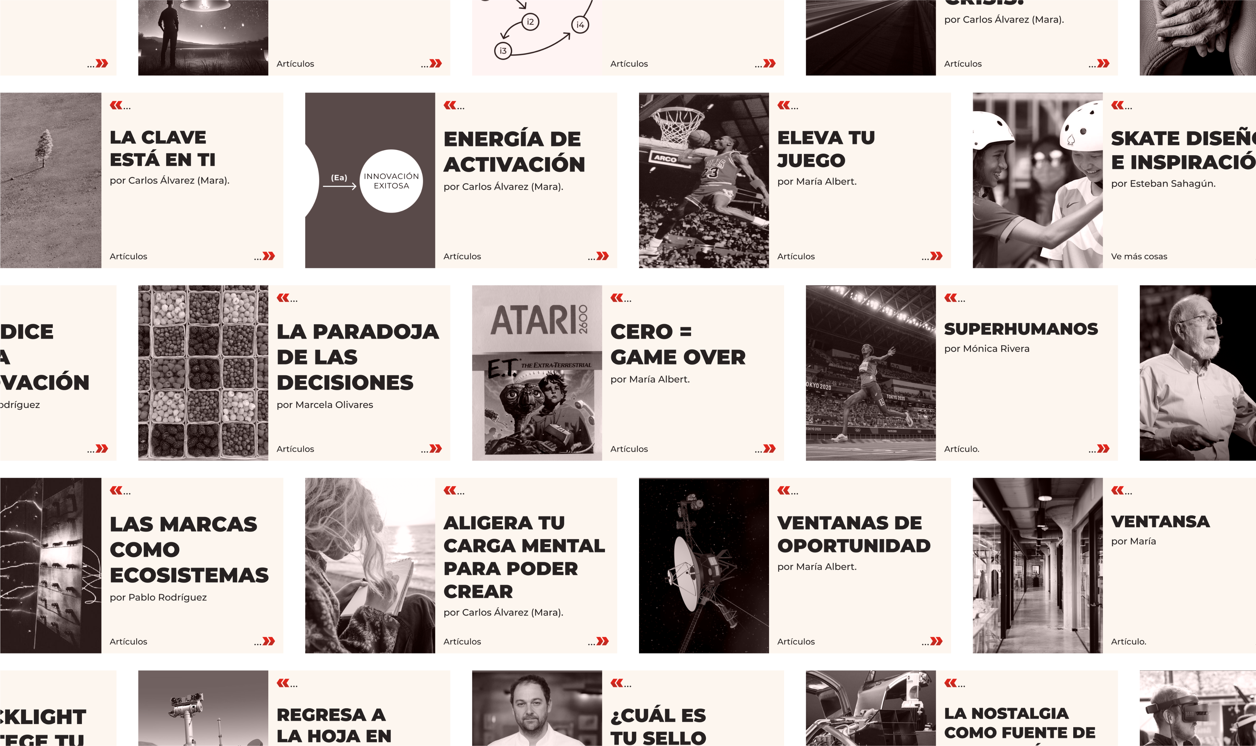
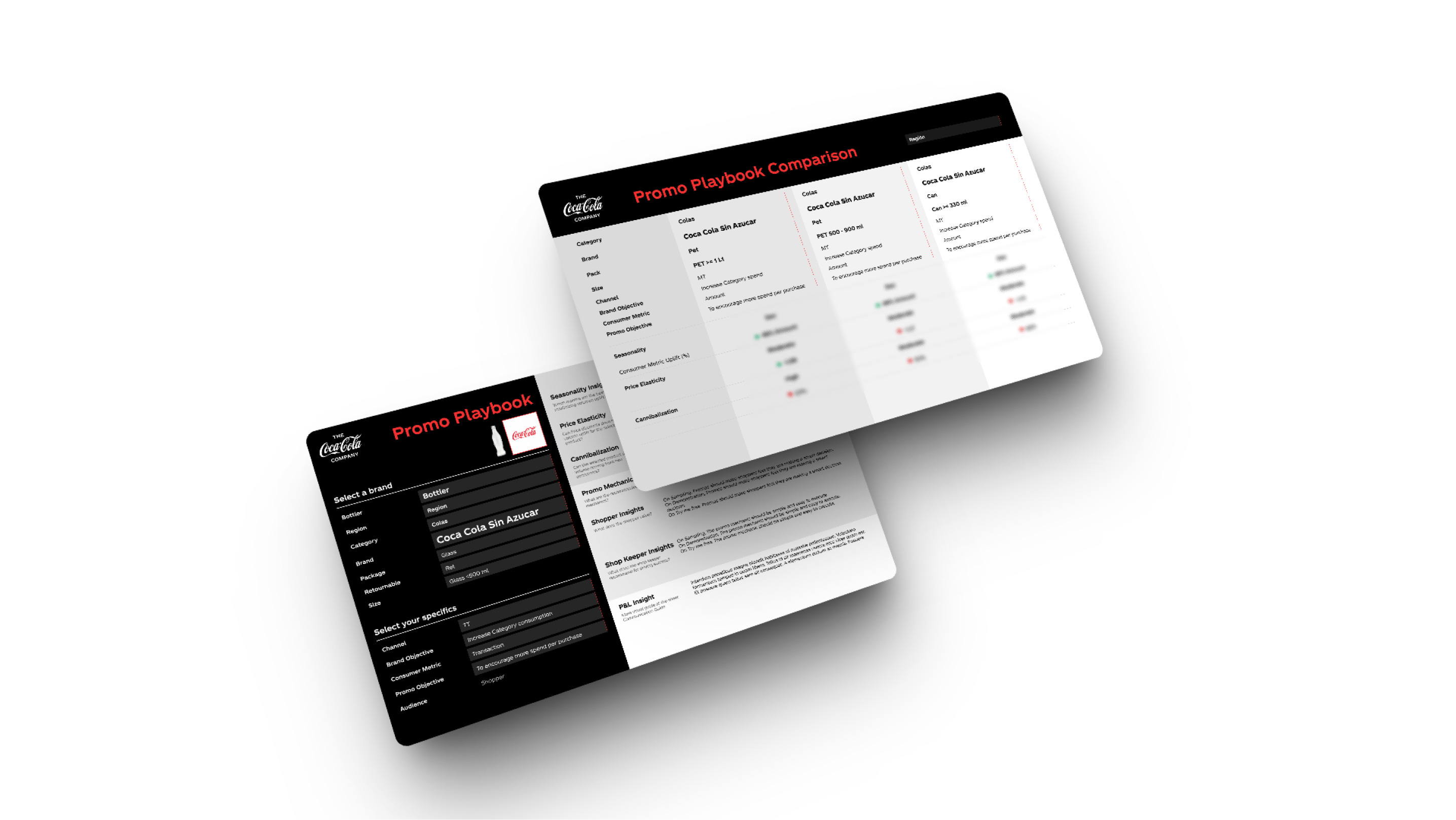
Developed a modular visual language in Figma, including brand colors, typography, layout grids and reusable components for articles, classes, decks and social media posts.

Accessibility & usability
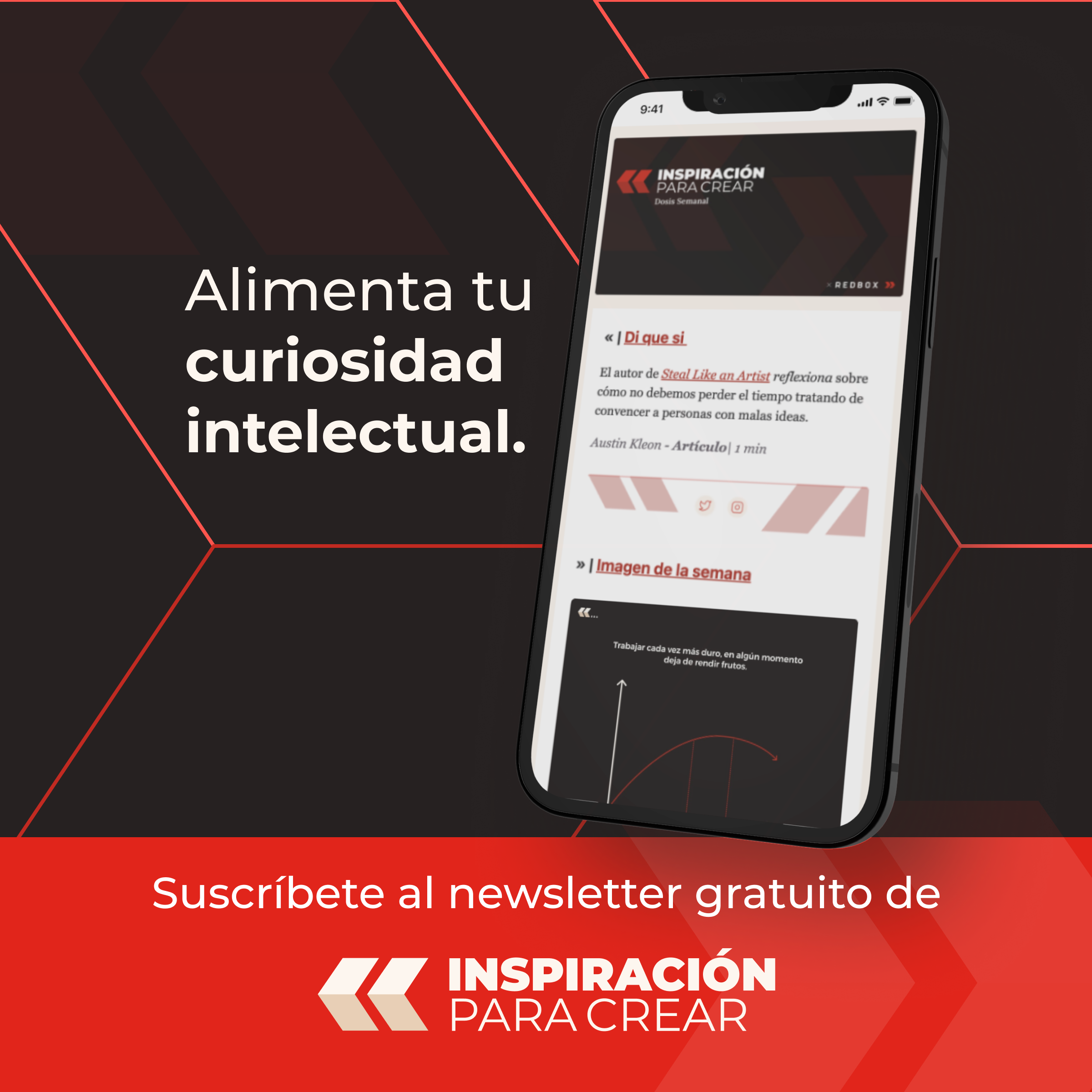
Built assets with clarity and flexibility in mind, ensuring non-designers could create branded materials with minimal friction. Delivered website designs, presentation templates, newsletter layouts and Instagram post formats.
Architecture thinking
IPC was also part of a larger internal effort I championed to unify RedBox’s sub-brands and formalize its visual language across initiatives.


Inspiración para Crear
Designing a brand that quotes, references, and inspires
Brand Development
+
Visual Language
+
Internal Architecture
2022
@RedBox
Inspiración Para Crear (IPC) emerged from a set of scattered initiatives inside RedBox, including a weekly newsletter, a blog of innovation cases, and training materials used in consulting projects. As the company’s Partner Director sought to formalize this content under one unified platform, IPC was born to test its potential as a standalone content-driven business unit.
Challenge
How might we create a brand and content platform that feels independent yet connected to RedBox, expresses thought leadership in Spanish, and scales across digital formats while staying accessible to non-designers?
Approach
From early conversations, I supported the definition of IPC’s dual identity: a public-facing inspiration feed (articles, newsletters, posts), and a private membership space for premium content, soft-skills classes and community building.
I helped articulate the visual personality by building on RedBox’s brand DNA and giving it a new expressive tone. My design direction was shaped by the idea of referencing and quoting, positioning IPC as a thoughtful, credible but approachable source of inspiration in the Spanish-speaking world.
Outcome
Internally, IPC became a catalyst for publishing, experimentation and knowledge sharing across teams. Its design system demonstrated the potential to extend RedBox’s brand beyond consulting and helped shape the visual evolution of other initiatives like RedBox Academy. It also served as a testing ground for building flexible tools that matched the needs of both designers and non-designers alike.
What I Learned
This project was a rare opportunity to follow a brand system from conception to deployment. I learned how to design for autonomy across internal teams, build with long-term maintainability in mind, and shape a brand that lives between editorial, educational and strategic territories.
Process Highlights
Brand language creation
Designed the full visual identity starting from RedBox’s existing box-shaped logo, reimagined as a Spanish opening quotation mark («). This symbol bridged IPC’s essence (quoting, referencing, opening ideas) while nodding to RedBox and its linguistic-cultural context.
Balanced authority and community through visual choices: warm but structured color palette, clear typographic hierarchy, and content-forward design.
Design system for scale
Developed a modular visual language in Figma, including brand colors, typography, layout grids and reusable components for articles, classes, decks and social media posts.
Accessibility & usability
Built assets with clarity and flexibility in mind, ensuring non-designers could create branded materials with minimal friction. Delivered website designs, presentation templates, newsletter layouts and Instagram post formats.
Architecture thinking
IPC was also part of a larger internal effort I championed to unify RedBox’s sub-brands and formalize its visual language across initiatives.