Tiendas Chata
Designing cohesionfor a brand built over generations
Visual Identity
+
Retail Experience
+
Brand Systems
2023
@RedBox
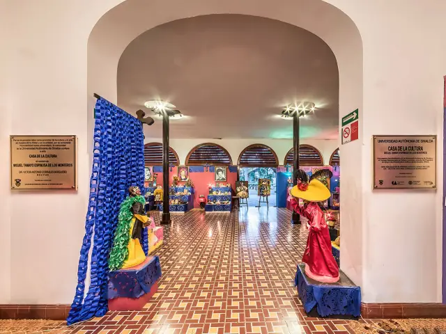
Tiendas Chata, a well-known Mexican food brand with over 60 years of history, was transitioning from a family-owned company to a national operation. As part of that growth, they began a retail standardization effort to unify the look and feel of their physical stores. However, despite their strong market recognition, they lacked a cohesive visual language across formats, products and touchpoints.
Challenge
How might we design a flexible yet authentic brand system that honors the legacy of Tiendas Chata while preparing it for a new generation of expansion?
Approach
Though the initial project was focused on physical materials and retail design, I was brought in when the team realized the brand’s portfolio was visually inconsistent. My role was to develop an extended brand language using the existing logo and early design explorations as a base.
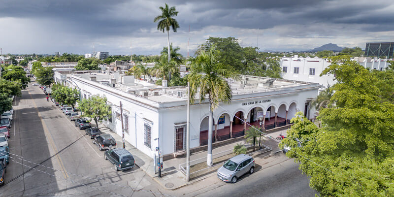
I studied the brand’s history, their most iconic product lines, and what made them recognizable in their hometown of Culiacán. Through conversations with the retail design team, I aligned with the strategic direction and helped shape a graphic system that reflected the same spirit and goals.
Outcome
Tiendas Chata began standardizing their stores and rolling out new packaging that clarifies their offer and strengthens brand consistency across locations. Although this wasn’t in the original project scope, the impact was immediate and well received by the client, the solution felt both natural and strategically sound.
Process Highlights
Brand language expansion
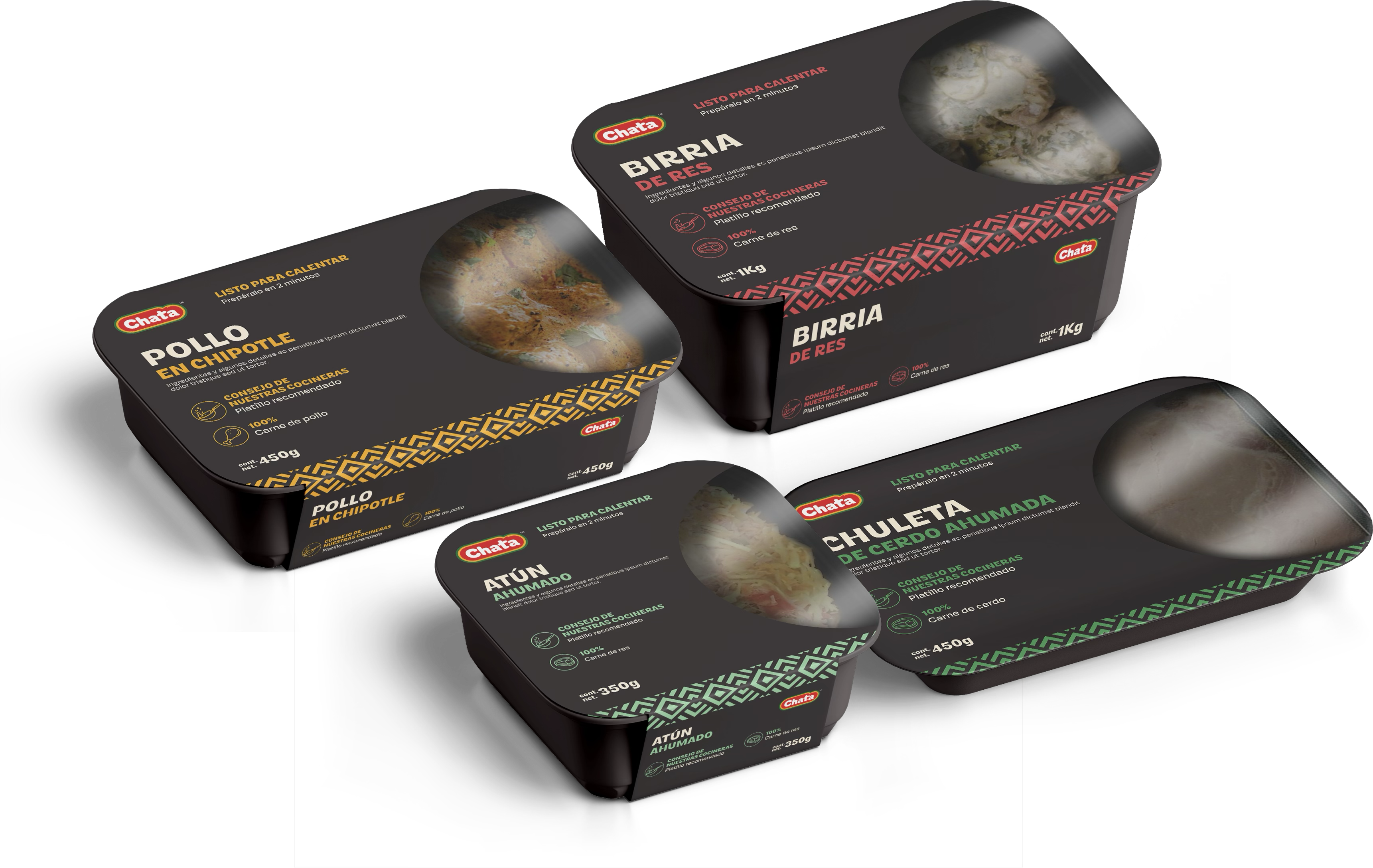
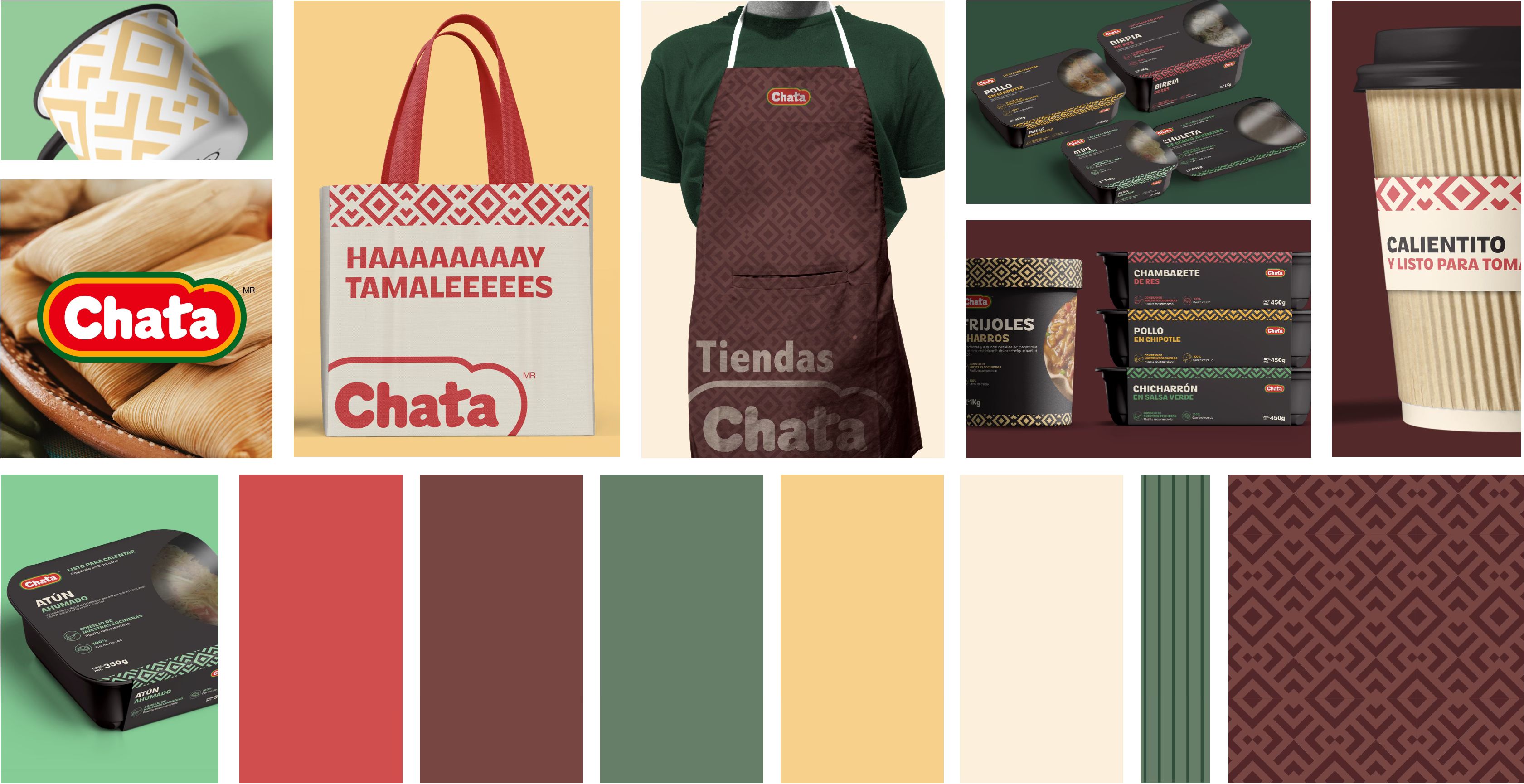
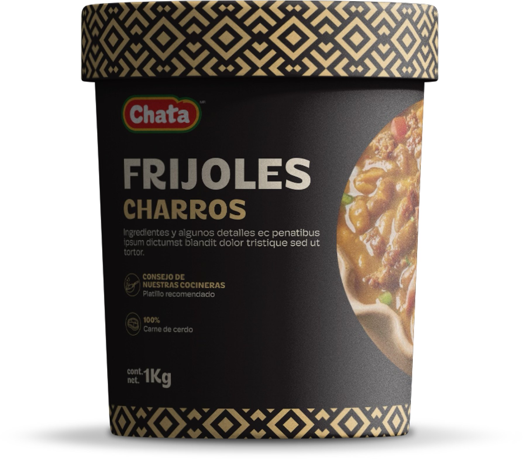
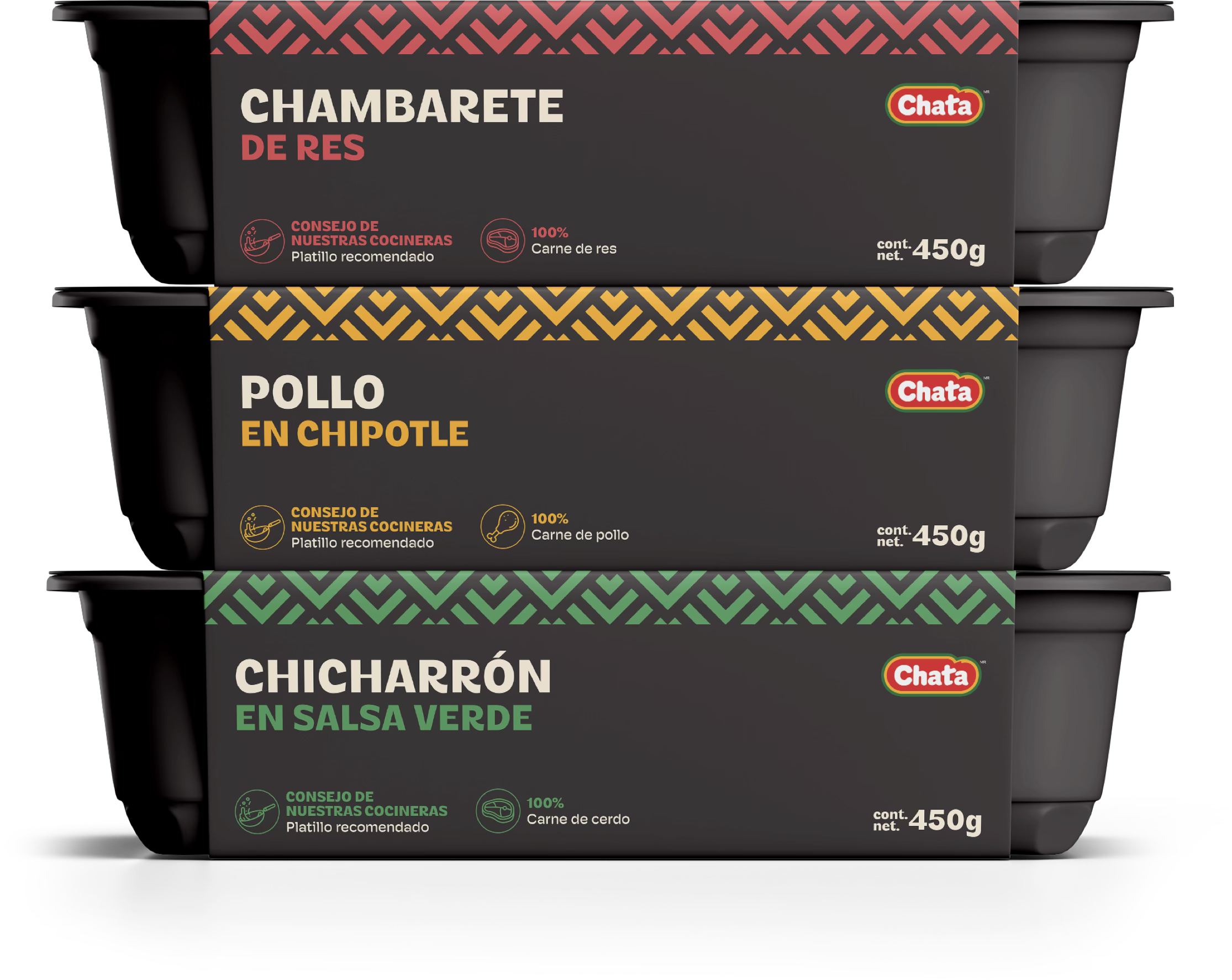
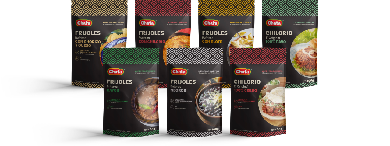
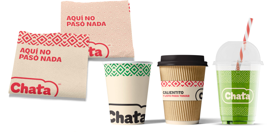
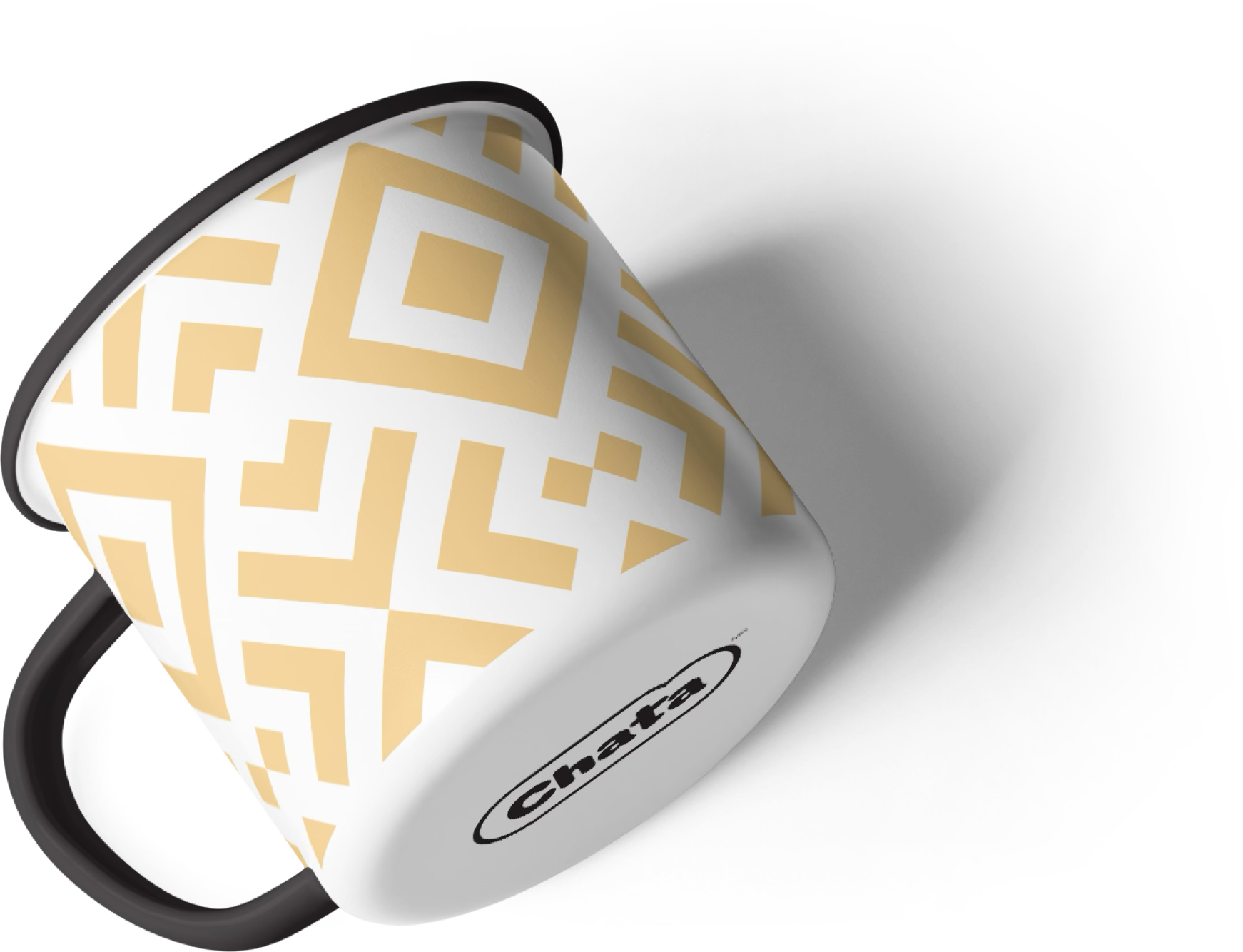
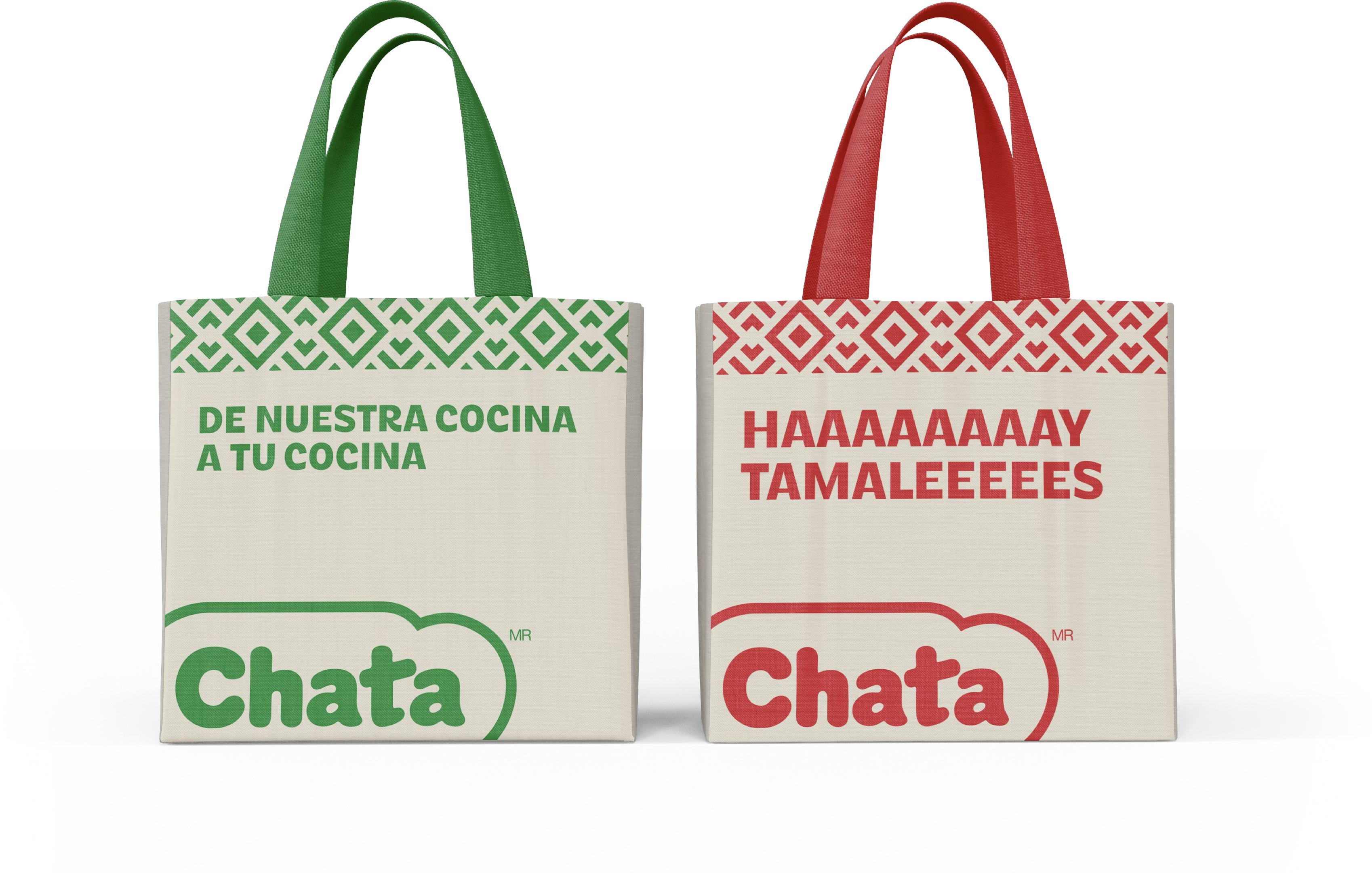
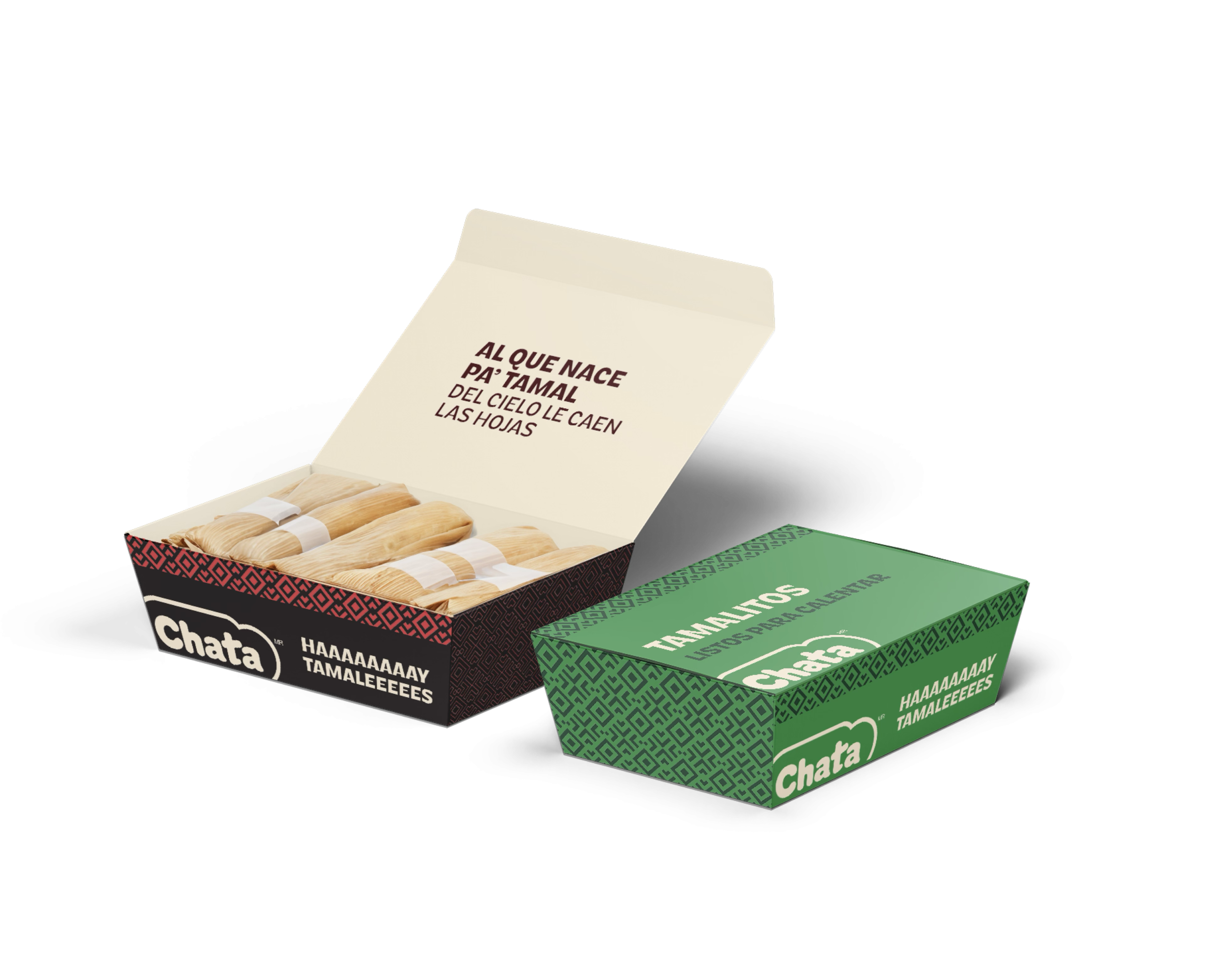
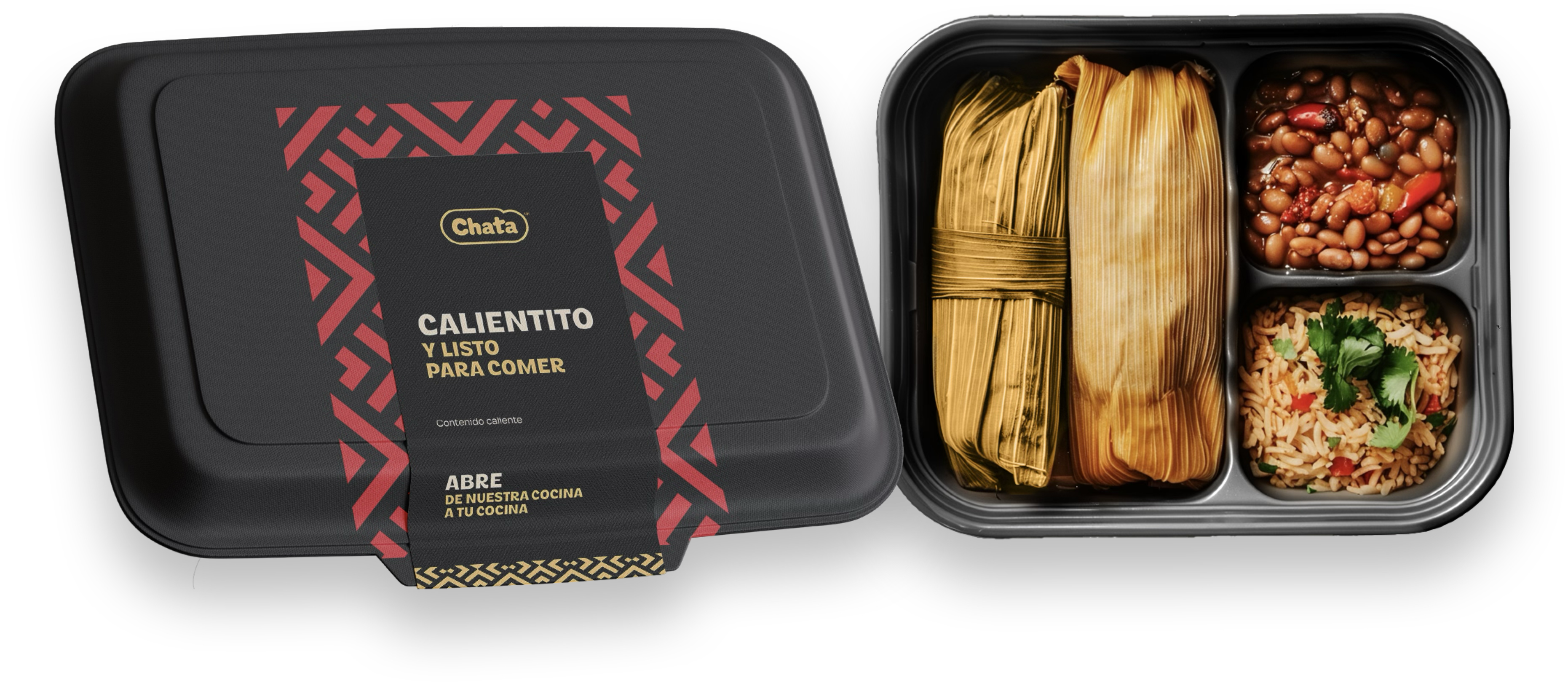
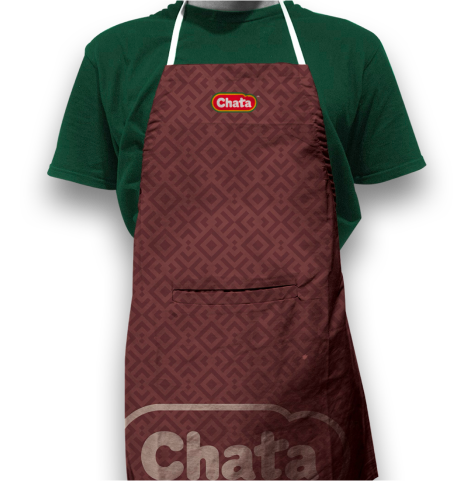
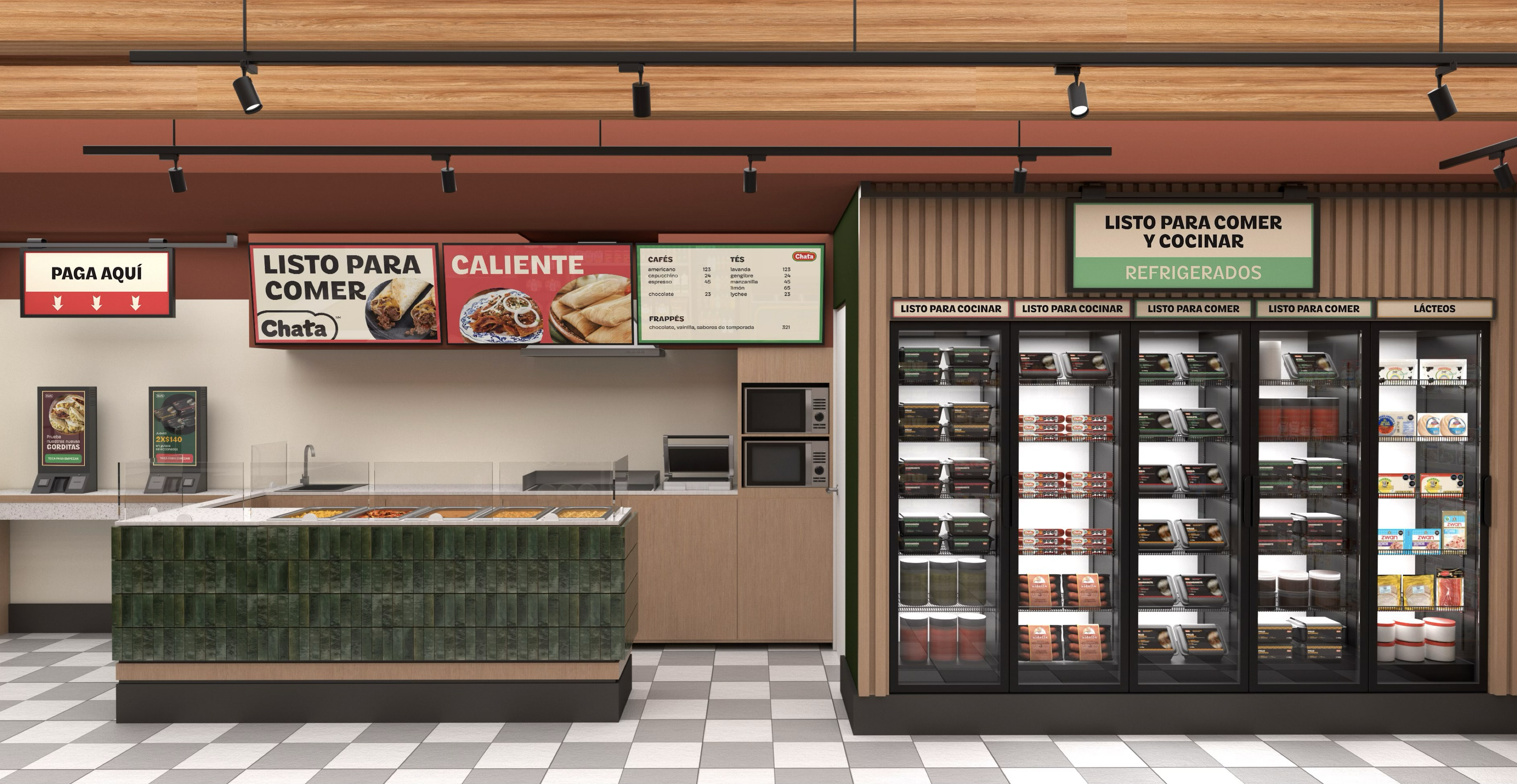
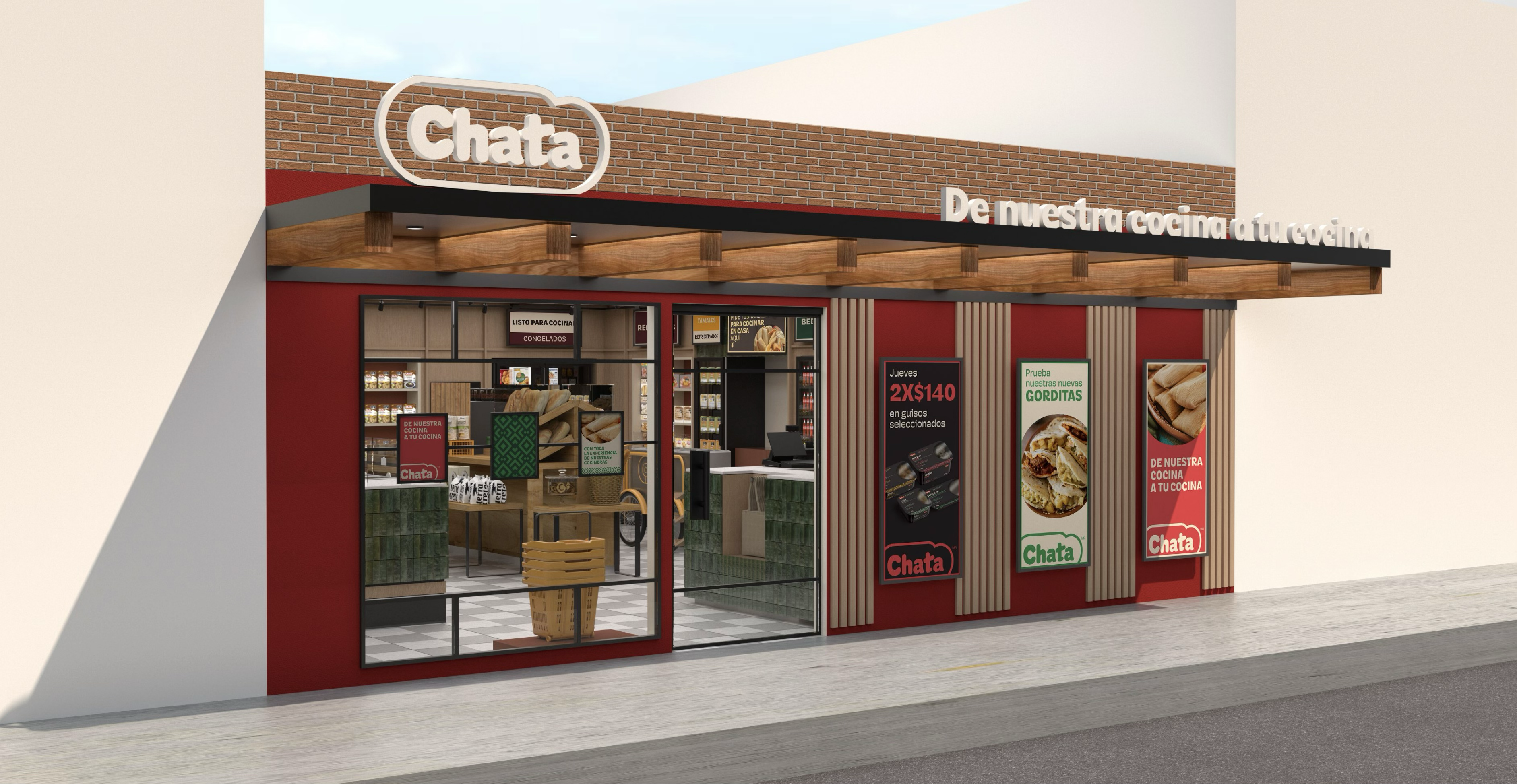
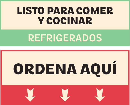
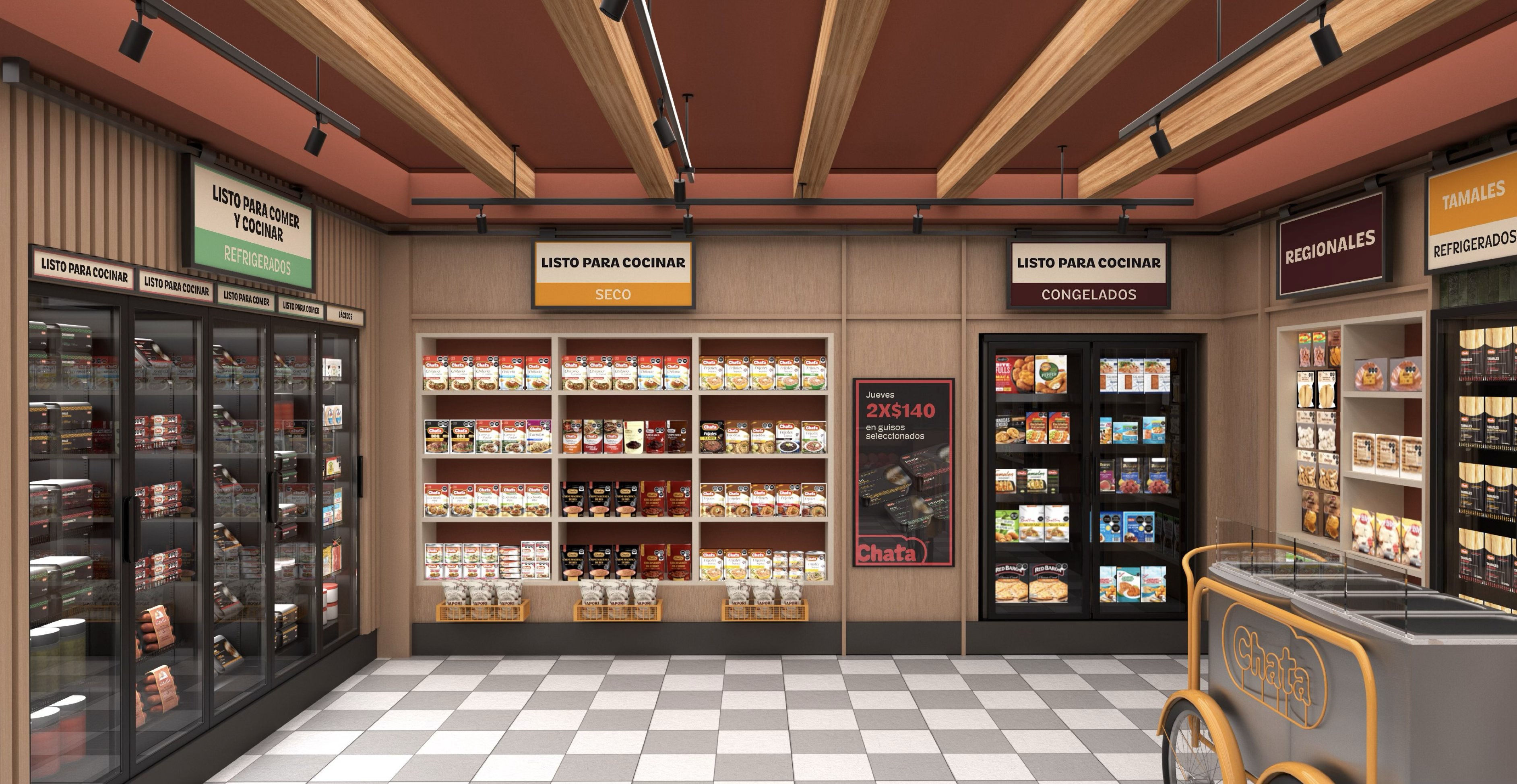
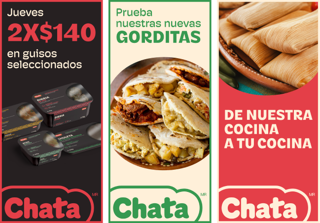
Extended the brand identity by creating new color palettes, selecting typographies, and designing graphic assets and layout components to unify packaging, signage and in-store materials.
Contextual sensitivity
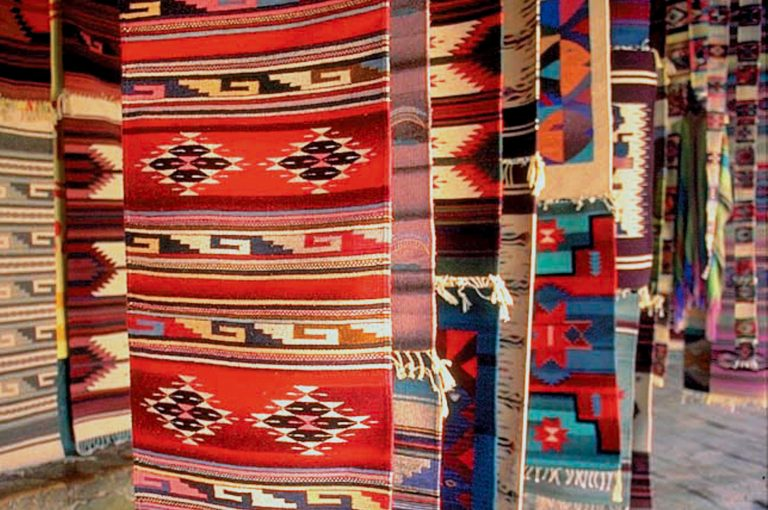
Grounded visual decisions in the brand’s cultural heritage and customer familiarity while supporting a new positioning that reflected Tiendas Chata’s ambition and range.


Flexible system design
Developed a system capable of adapting across diverse categories including proteins, ready-to-eat meals, traditional Mexican dishes and pantry staples.
Deliverables
Produced a brand language document, packaging mockups, retail communication templates and signage components to support physical rollout.
Collaboration and leadership
Worked closely with two consultants leading the strategic narrative and an industrial designer developing the physical store experience.


Tiendas Chata
Designing cohesionfor a brand built over generations
Visual Identity
+
Retail Experience
+
Brand Systems
2023
@RedBox
Tiendas Chata, a well-known Mexican food brand with over 60 years of history, was transitioning from a family-owned company to a national operation. As part of that growth, they began a retail standardization effort to unify the look and feel of their physical stores. However, despite their strong market recognition, they lacked a cohesive visual language across formats, products and touchpoints.
Challenge
How might we design a flexible yet authentic brand system that honors the legacy of Tiendas Chata while preparing it for a new generation of expansion?
Approach
Though the initial project was focused on physical materials and retail design, I was brought in when the team realized the brand’s portfolio was visually inconsistent. My role was to develop an extended brand language using the existing logo and early design explorations as a base.
I studied the brand’s history, their most iconic product lines, and what made them recognizable in their hometown of Culiacán. Through conversations with the retail design team, I aligned with the strategic direction and helped shape a graphic system that reflected the same spirit and goals.
Outcome
Tiendas Chata began standardizing their stores and rolling out new packaging that clarifies their offer and strengthens brand consistency across locations. Although this wasn’t in the original project scope, the impact was immediate and well received by the client, the solution felt both natural and strategically sound.
Process Highlights
Brand language expansion
Extended the brand identity by creating new color palettes, selecting typographies, and designing graphic assets and layout components to unify packaging, signage and in-store materials.
Contextual sensitivity
Grounded visual decisions in the brand’s cultural heritage and customer familiarity while supporting a new positioning that reflected Tiendas Chata’s ambition and range.
Flexible system design
Developed a system capable of adapting across diverse categories including proteins, ready-to-eat meals, traditional Mexican dishes and pantry staples.
Deliverables
Produced a brand language document, packaging mockups, retail communication templates and signage components to support physical rollout.
Collaboration and leadership
Worked closely with two consultants leading the strategic narrative and an industrial designer developing the physical store experience.